Designing Technology That Feels Simple, Welcoming, and Easy to Use
Simple, welcoming software isn’t about fewer features—it’s about clearer choices, kinder language, and respect for people’s time. Here’s how to design products that feel effortless and drive real business results.
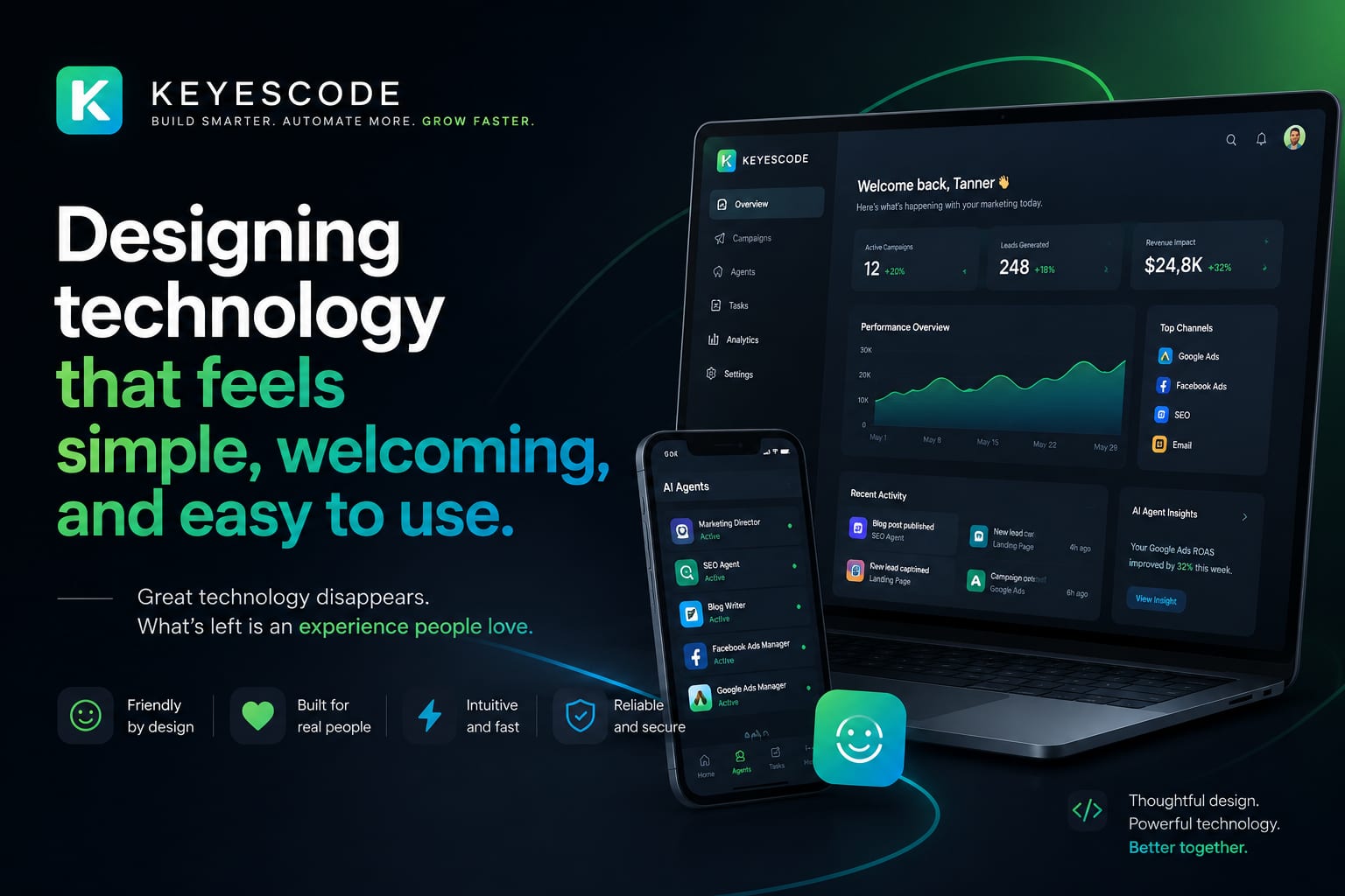
When technology feels simple and welcoming, people start faster, stick longer, and need less help. That’s not a design nicety—it’s a business advantage. In this guide, we’ll show how to make products feel effortless without dumbing them down, and where KeyesCode fits if you want a partner to design and build it right.
What “simple and welcoming” looks like in business terms
Simple software shortens the path to value. The impact shows up in a few metrics:
- Faster activation: More users complete onboarding and reach their first success.
- Higher conversion: Fewer drop-offs at key steps (signup, checkout, invite teammates).
- Lower support volume: Clearer flows, better empty states, and integrated help reduce tickets.
- Greater retention: People return when the product solves a job with less effort.
- Better NPS and reviews: Ease and clarity drive trust.
If you can’t connect your design decisions to these outcomes, you’re guessing. At KeyesCode, we instrument flows from day one and tie UX work to measurable lift. We’ve applied this approach across custom software, SaaS, and mobile projects (see examples at https://www.keyescode.com/portfolio).
Principles that make tech feel easy
The shortest version: reduce cognitive load, make good choices obvious, and recoveries painless.
- Start with jobs-to-be-done. Map the primary job your user hires you for. Every screen and control should support that job or get out of the way.
- One primary action per screen. Everything else is secondary or hidden behind progressive disclosure.
- Use plain language. Trade jargon and labels like “Execute” for verbs people use in conversation. Microcopy matters.
- Progressive disclosure. Show essentials by default; reveal complexity when people ask for it.
- Smart defaults. Pre-fill sensible values. Remember preferences. Default to safe settings.
- Visible system status. Show what’s happening, what’s next, and how long it will take. Loading, saving, syncing—make progress explicit.
- Forgiving by design. Inline validation, undo, version history, and clear escape hatches reduce anxiety.
- Consistency over cleverness. Reuse patterns. If something works one way in one place, keep it that way everywhere.
- Accessibility by default. WCAG-compliant color contrast, keyboard support, alt text, focus states, and motion controls help everyone.
- Performance as a feature. Sub-200ms interactions feel instant. Set a speed budget and hold to it.
These principles are simple to state and hard to execute. That’s why process—and saying “no” to low-value complexity—matters.
Patterns that create ease (with examples)
Onboarding that respects time
- A zero-data state that explains what will happen and why it’s worth it.
- One-minute setup: defer non-essentials. Offer imports and sample data so people can try real tasks immediately.
- Contextual guidance: hotspots and tooltips that appear just-in-time, not as a 10-step tour.
- A visible “What’s next” checklist with progress.
How we’d do it: At KeyesCode we prototype onboarding, then run 3–5 quick usability tests before building. We also integrate analytics events to measure drop-off and iterate post-launch. For AI-enabled products, we add prompt templates and example queries so users aren’t starting from a blank chat (https://www.keyescode.com/services/ai).
Navigation that feels predictable
- Keep the hierarchy shallow. Don’t bury key tasks more than two clicks deep.
- Make the current location obvious. Use clear labels and breadcrumbs.
- Offer a great search that understands synonyms, intent, and typos.
If your app has depth or a large knowledge base, consider AI-augmented search that returns answers, not links. KeyesCode’s AI Search Optimization (GEO) aligns content, metadata, and retrieval so users find what they need fast (https://www.keyescode.com/services/ai-search-optimization).
Forms that don’t make people think
- Ask only what you need. Remove optional fields or collect them later.
- Use the right controls: dates with calendars, countries with typeahead, phone with formatting.
- Inline, friendly validation. Tell people how to fix an issue as soon as it appears.
- Mobile-first sizing, spacing, and keyboard selection.
Language and tone that welcome
- Write like a person. Prefer “Save changes” to “Persist modifications.”
- Reduce anxiety: “You can edit this later” beats “This action is irreversible” (unless it truly is).
- Explain benefits next to actions: “Connect bank—securely import last 90 days.”
- Celebrate wins with restraint: clear confirmations beat confetti for routine tasks.
Trust, transparency, and control
- Clear pricing and limits. No surprises.
- Upfront permissions with short explanations. Link to details.
- Activity history and undo wherever possible.
- For AI features: show inputs, sources, and confidence; let users correct outputs; provide guardrails and human handoff.
Help built into the experience
- Contextual help: tooltips, inline FAQs, and links to short docs or 30-second videos.
- Searchable help center and in-product search that spans docs and data. If you want it to answer in plain English, we can help with RAG and embeddings (https://www.keyescode.com/services/ai-consulting).
- Easy escalation to a human via chat or email when needed.
Designing AI experiences that feel safe and useful
AI can feel magical or mysterious. The difference is design.
- Start with templates. Offer task-focused prompts (“Summarize this contract to 5 bullet points highlighting obligations”) and let users tweak.
- Show your work. Cite sources, highlight changed fields, and provide a diff or preview before committing changes.
- Make uncertainty visible. Confidence tags, “may be outdated” notices, and clear boundaries for data access.
- Offer sandbox modes and dry runs. Let users preview automations on sample records.
- Provide instant escape hatches: undo, version history, and “revert to original.”
KeyesCode builds AI agents and automations with these patterns baked in—observability, audit trails, and safety checks come standard (https://www.keyescode.com/services/ai).
Accessibility and inclusion are simplicity multipliers
Accessibility improvements help everyone:
- Keyboard navigation and visible focus states speed up power users.
- High contrast and scalable type help readability in bright or low-light environments.
- Captions and transcripts make videos usable in quiet offices and noisy job sites.
- Avoid relying on color alone; use icons and labels.
- Respect motion sensitivity and provide reduced motion options.
- Write at an accessible reading level and support localization.
We embed WCAG 2.2 AA checks into design systems and CI/CD so regressions are caught before release. If you’re building a mobile app, we test with native screen readers and platform accessibility tools (https://www.keyescode.com/services/mobile).
Performance and platform considerations that keep things smooth
Speed is the simplest form of kindness. A few tactics:
- Set a performance budget (e.g., first interaction under 200ms on mid-tier devices) and enforce it.
- Preload likely next screens; defer heavy work off the main thread.
- Use skeletons and optimistic UI so the app feels alive during network calls.
- Cache strategically and handle offline gracefully where possible.
- Size tap targets for touch, and favor native patterns on iOS/Android.
Under the hood, clean architecture helps: edge caching, efficient queries, and observability. KeyesCode designs cloud infrastructure that supports snappy experiences at scale (https://www.keyescode.com/services/cloud) and builds custom backends when off-the-shelf tools don’t fit (https://www.keyescode.com/services/custom).
A practical, low-risk process to get there
You don’t need a big-bang redesign. Move in measured steps:
- Discover and align
- Identify the primary job-to-be-done and top 3 flows by business impact.
- Review analytics, search logs, and support tickets. Watch 5 users attempt core tasks.
- Define success metrics: activation rate, time-to-first-value, success rate on task X, ticket types.
- Prototype the ideal path
- Sketch low-fidelity flows to reduce choices and highlight the primary action.
- Add sample data and empty states. Draft microcopy.
- Test with 5–7 target users. Observe, don’t explain. Note friction and confusion.
- Build with a design system
- Codify spacing, type, components, states, and accessibility patterns.
- Instrument events for the metrics defined in discovery.
- Set a performance budget and automated checks.
- Launch, measure, iterate
- Roll out behind a feature flag or to a cohort. Compare against baseline.
- Fix hotspots. Tighten copy. Trim steps.
- Document what worked and make it part of the system.
This is the core of how we work at KeyesCode across SaaS and mobile engagements (https://www.keyescode.com/services/saas, https://www.keyescode.com/services/mobile). It keeps risk low and results trackable.
Common traps to avoid
- Feature bloat: shipping options because they’re easy to build, not because users need them.
- Org-chart navigation: reflecting internal teams instead of user tasks.
- Clever over clear: novel interactions that break expectations.
- Modal overload: interrupting flows for minor decisions.
- Hidden complexity: burying prerequisites that cause errors later.
- Dark patterns: short-term gains that erode trust and retention.
When in doubt, remove, rename, or reorder. Then watch what happens.
Quick checklist before you ship
- Does each screen have one obvious primary action?
- Can a first-time user complete the core job in under 3 minutes?
- Are labels, copy, and error messages written in plain language?
- Are empty states, loading, and success states designed (not left blank)?
- Can users undo or recover from mistakes?
- Do key flows meet accessibility basics: contrast, keyboard, focus?
- Is performance budgeted, measured, and under target on mid-tier devices?
- Is help discoverable in-context, with a clear path to a human?
- For AI features: are sources, limits, and confidence visible?
A brief example: from “busy” to “breezy” in a billing portal
A mid-market B2B company came to us with a customer billing portal struggling with activation and high support volume. The team suspected they needed more filtering and advanced options. We did the opposite.
What changed:
- Rewrote the dashboard to focus on the top job: “Review and pay current invoices.”
- Moved historical exports and advanced settings behind a clear secondary menu.
- Added a zero-state that explained statement cycles and available payment methods.
- Introduced smart defaults: default to the most recent unpaid invoice and the last-used payment method.
- Built a trustworthy confirmation step with a clear undo window.
- Instrumented analytics and added contextual help links to short articles.
Results over six weeks:
- Time-to-first-payment dropped by half.
- Support tickets about “How do I pay?” fell significantly.
- Repeat logins increased as customers trusted the flow and saved preferences.
The code changes were modest; the impact came from focusing on the job-to-be-done, clear copy, and fewer choices at the right time. That pattern applies to internal tools, SaaS products, mobile apps, and AI-enabled features alike.
Bringing it all together
Simplicity isn’t fewer features. It’s fewer decisions, better defaults, and humane language—grounded in research and measured in outcomes. If you want help auditing a flow, prototyping a friendlier onboarding, or building a new product with simplicity baked in, KeyesCode can partner from strategy through launch:
- AI strategy, agents, and in-product assistance: https://www.keyescode.com/services/ai
- AI consulting and RAG/search optimization: https://www.keyescode.com/services/ai-consulting and https://www.keyescode.com/services/ai-search-optimization
- SaaS platforms and internal tools: https://www.keyescode.com/services/saas and https://www.keyescode.com/services/custom
- Mobile apps and cloud infrastructure: https://www.keyescode.com/services/mobile and https://www.keyescode.com/services/cloud
Have a flow that feels harder than it should? Let’s make it welcoming. Schedule a conversation at https://www.keyescode.com/schedule or reach out at https://www.keyescode.com/contact.
Want this kind of result for your business?
We'll audit your site for conversion gaps and suggest 2–3 AI integrations you could ship in 30 days. No pitch, no pressure.